Understanding Society is the largest longitudinal household panel study of its kind and provides vital evidence on life changes and stability. It analyses how families and communities change over time, how social and political opinions develop and plays a key role in medical research, helping us better understand health and treat diseases.
Every year Understanding Society collates the information and produces an annual in-depth look at the evidence on topical policy issues.
The brief / project objectives
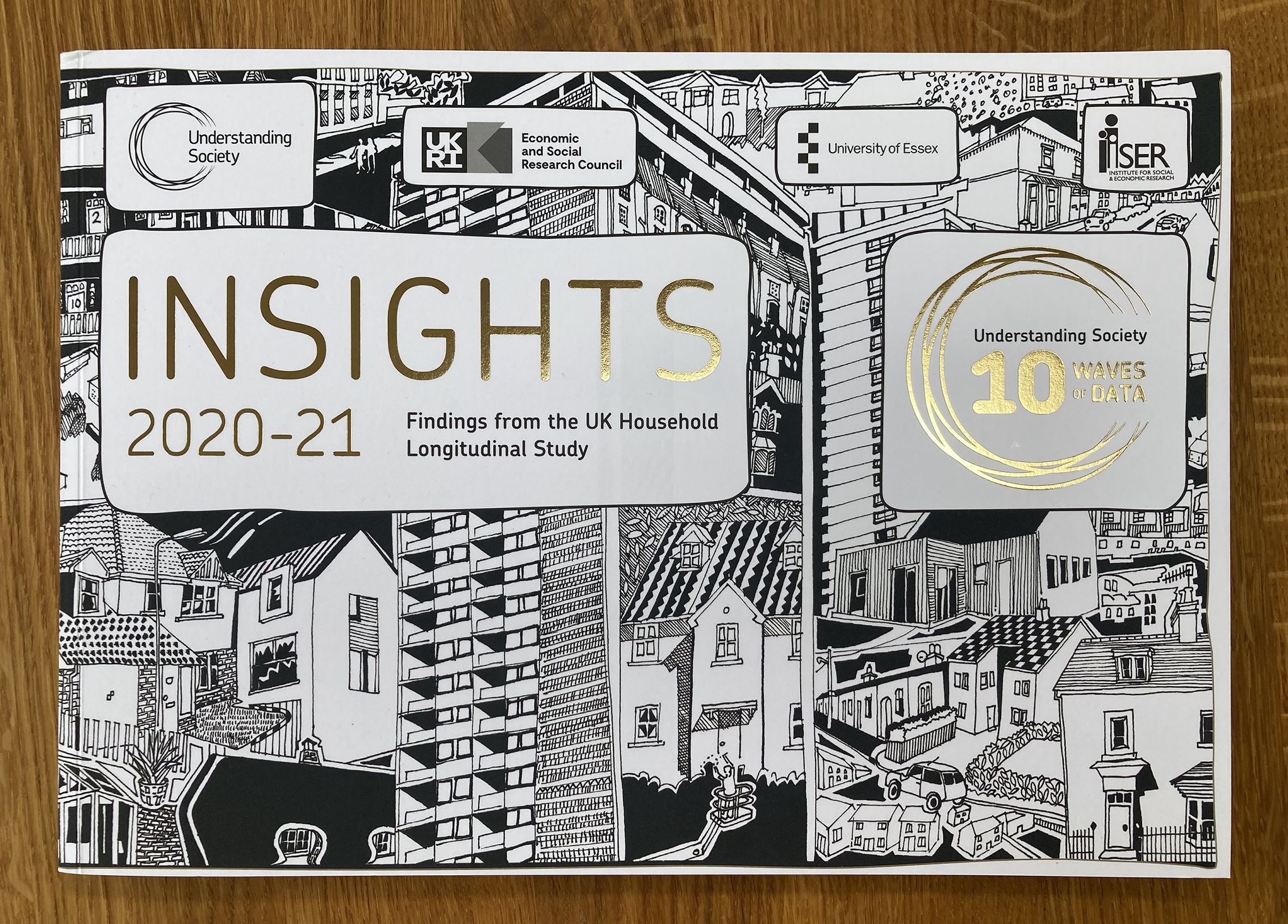
In 2021 the Study launch its tenth Insights report, celebrating 10 Waves of Data and the research which has benefited from longitudinal data, examining change in people’s lives over time. I was commissioned to create a superior quality, celebratory brochure to champion the work carried out since the Study began.
This included the creation of a new 10 Waves of Data logo, that would be used not only in the brochure but also across other marketing associated with the Study’s landmark achievement. The premium print finish elevates the feel of the brochure to create a lasting positive impression; soft touch laminate, wrap-around cover with metallic foil blocking and beautiful end papers – all printed on recyclable, high quality matt stock.
Over 80 pages, Insights 2021 addresses:
• civic engagement
• education and training
• employment and non-employment
• family, household and social connectedness
• health and health behaviours
• income, consumption and wealth
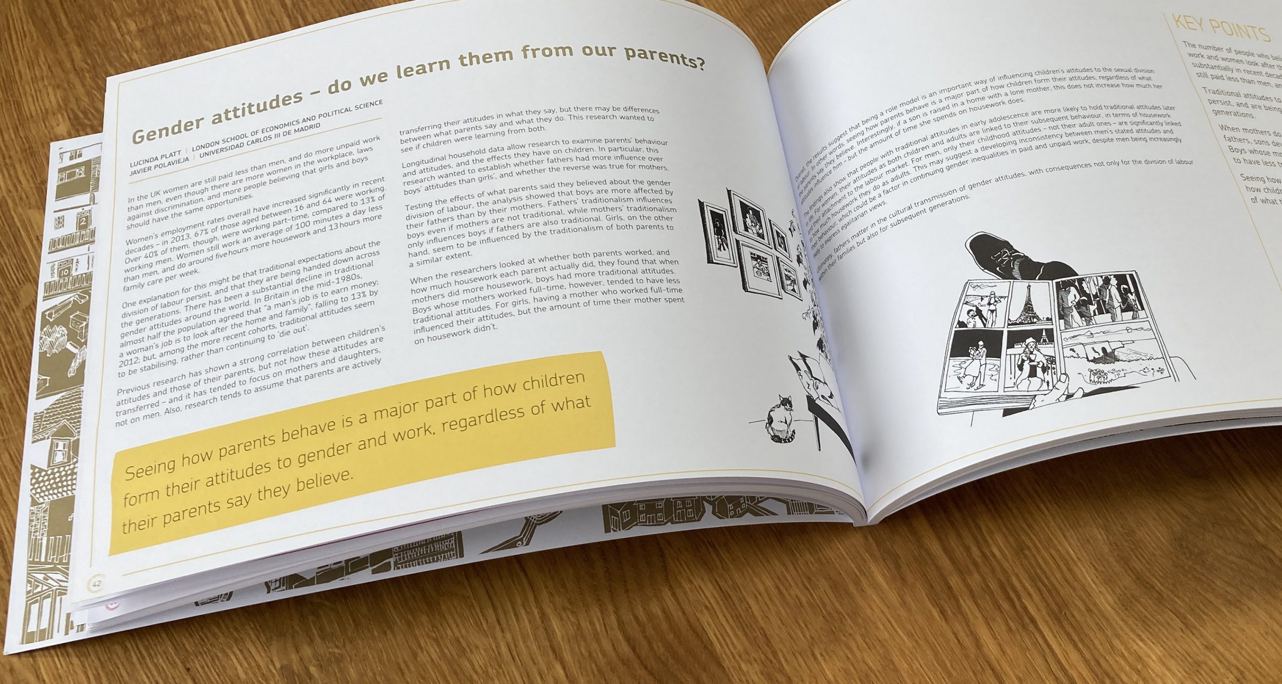
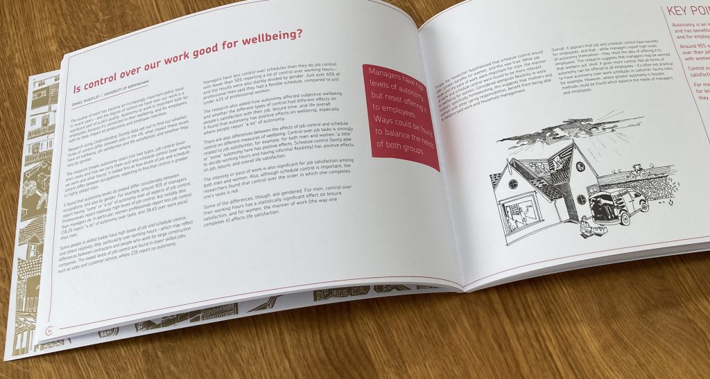
The brochure features specially commissioned illustrations and a dynamic and distinctive design throughout, that celebrates the importance of longitudinal data.
Insights 2021-22 was the first brochure designed solely for digital use, due to restrictions during the pandemic. So we made full use of the digital platform, adding lots of useful hyperlinks to quickly direct readers to a wide resource of information.
The design clearly distinguishes each chapter through use of colour, enabling the reader to easily navigate the information. Hand-drawn motifs overlay photographic images, representing the copious note-taking and gathering of information. This styling is also used to highlight key quotes and author references. The relaxed, sketch-like graphics reflect the informal, conversational tone in which the interviewers interact with participants.
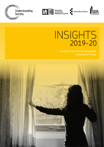
Each year we seek to produce a stand-alone document that, whilst is on-brand, creates a distinctive look to represent the unique content within. Insights 2019-2020 featured a photographic style, with strong colour overlays. Download the digital copy by clicking here or on the image.