Barn Farm Drinks are third generation family farmers, passionate about growing berries, which they then press and bottle into high quality juice on their farm, which overlooks the beautiful River Stour in Essex.
Bursting with flavour, their drinks have been winning awards for taste each year and sell very well locally. But the label design was holding the products back from success in hip cities such as London and Brighton.
the brief / project objectives
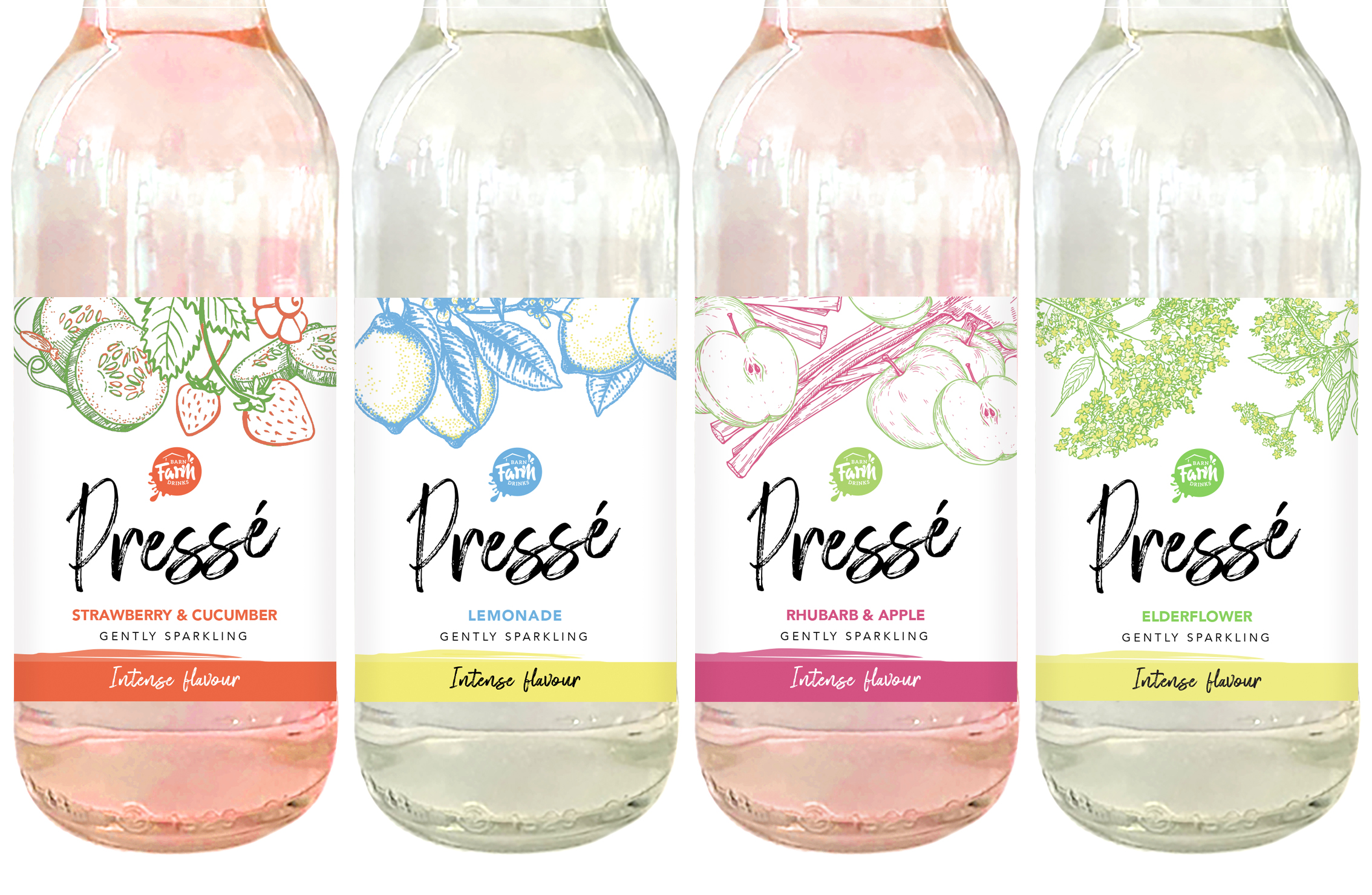
Recognising that the branding needed to be brought up-to-date to appeal to a contemporary audience, Barn Farm Drinks asked me to redesign the labels for their Pressé range of drinks.
The new designs feature colourful illustrations of the fruit, in a loose style to represent a fresh, authentic feel. This is also reflected in the hand-written fonts and paint-brush colour swooshes, which together with the full-bleed composition, suggests a product that is bursting with flavour; yet there is plenty of white space to give the design a light, contemporary feel, to appeal to a modern audience.
re-design of the pressed fruit juice range
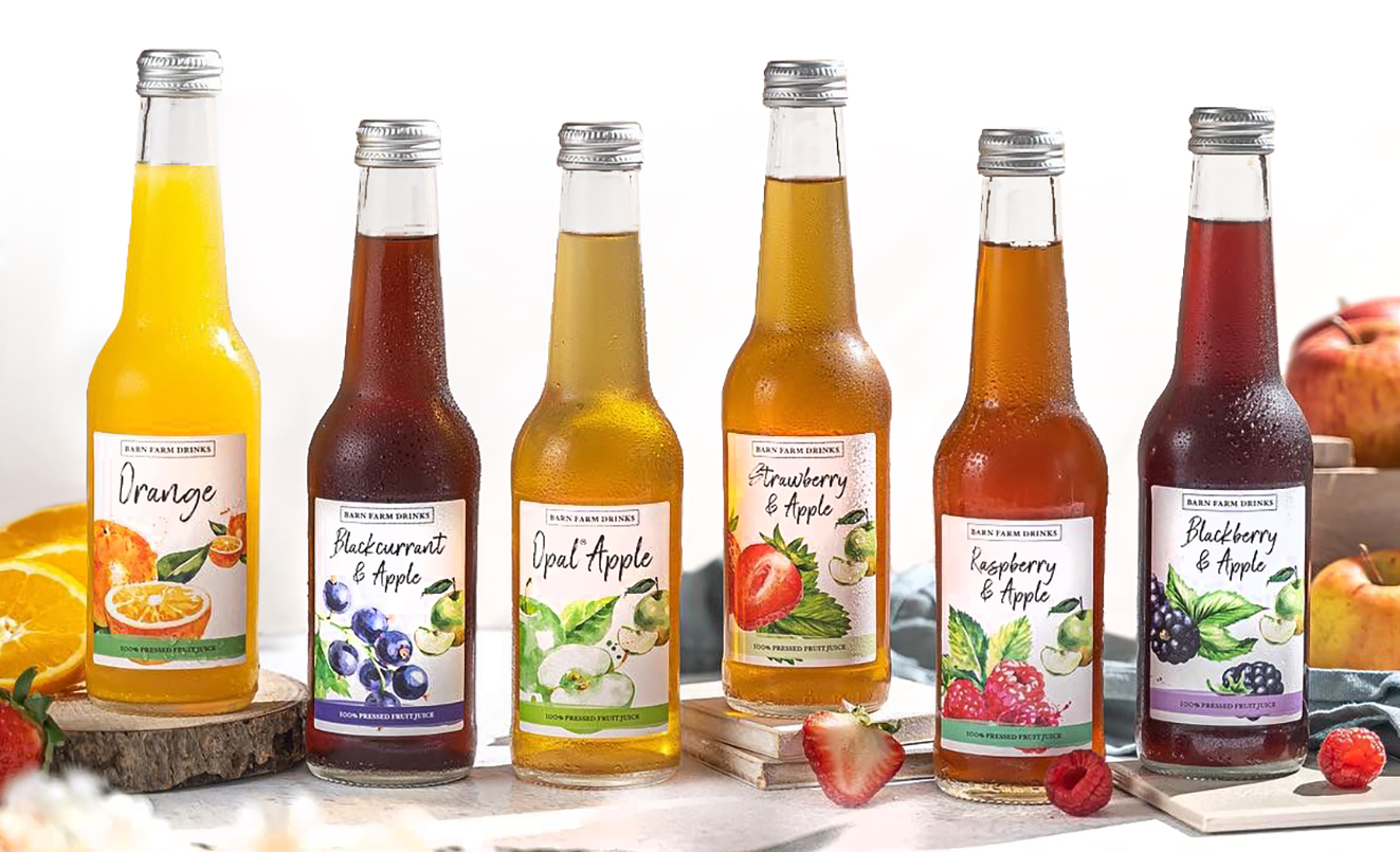
Following the successful launch of their Pressé redesign, Barn Farm Drinks asked me to then redesign their core range of pressed fruit juice drinks; to bring their overall image up-to-date. As with the Pressé labels, this consisted of front and back bottle labels.
The decision was also made to look at simplifying and modernising the existing Barn Farm Drinks logo, giving the new labels a complete re-brand. The new logo sits at the top of the bottle label, with the brand name depicted in a contemporary sans-serif font. The previous logo is featured on the reverse label, to provide brand continuity and aid customer recognition.
The colourful watercolour illustrations of the key ingredients are the ‘hero’ of the label design. The loose style and paint splashes denote a fresh, authentic feel, reflecting the nature of the produce. The distinctive hand-written font from the Pressé range has been carried through to the new Pressed Fruit Juice labels, bringing a synergy between the two drinks ranges.
here's what the client thinks
“We have worked with Joy on several projects over the past few years, every single one was an absolute pleasure. Joy was very professional, and really took the time to understand where we wanted to take the brand. Throughout all of the projects she used her vast amount of designing expertise and hit the nail on the head every single time without fail. I would recommend Joy in a heartbeat to anyone looking for a professional designer.”
Charlie Williamson | Business Development Manager Barn Farm Drinks